How to Use Blur View Modifier and Material Type in SwiftUI
SwiftUI comes with the blur view modifier since the first release back in 2019. The blur modifier allows you to add gaussian blur to any view to which it is applied to. With SwiftUI release 3 came a new type called Materials. Materials provides us with different pre-made blur effects which are aligned with Apple's Human Interface Guideline.
In this tutorial, we will discuss about both these modifiers. Let's start with blur view modifier.
Blur View Modifier in SwiftUI
struct ContentView: View {
  var body: some View {
    ZStack {
        Image(systemName: "flame.fill")
            .resizable()
            .aspectRatio(contentMode: .fit)
            .frame(width: 150, height: 150, alignment: .center)
            .foregroundColor(.blue)
            .blur(radius: 8, opaque: false)
    }
  }
}
In order to use the blur view modifier, just add the modifier to any view you want to blur. Here you can see I am adding the blur modifier to the Image view. The blur modifier takes in two parameters in order to customize the end result. The radius parameter defines the radial size of the blur. The second one is Opaque, which allows you to set the transparency of the blur. It is set to false by default.
Materials Type:
struct ContentView: View {
    var body: some View {
        ZStack {
            LinearGradient(colors: [.purple, .yellow], startPoint: .top, endPoint: .bottom)
                .ignoresSafeArea()

            Text("Regular")
                .padding(30)
                .background(
                    .regularMaterial,
                    in: RoundedRectangle(cornerRadius: 8, style: .continuous)
                )


        }
    }
}
The above code is slightly different as I am applying the materials effect to a Text view. Materials type is pre-made blur effects provided to us by Apple. The effect provides us with a translucent effect that matches that of a glass. As you can see in the code above, we are using the background modifier to add regular material type to the Text view. Note here that the material type isn't actually a background but rather its like inserting a translucent view between the text view and the background.
Here is how the regular material looks like:

In order to reduce the opaqueness we can use thin or ultra thin material type. Like this:
struct ContentView: View {
    var body: some View {
        ZStack {
            LinearGradient(colors: [.purple, .yellow], startPoint: .top, endPoint: .bottom)
                .ignoresSafeArea()

            Text("Regular")
                .padding(30)
                .background(
                    .ultraThinMaterial,
                    in: RoundedRectangle(cornerRadius: 8, style: .continuous)
                )
        }
    }
}
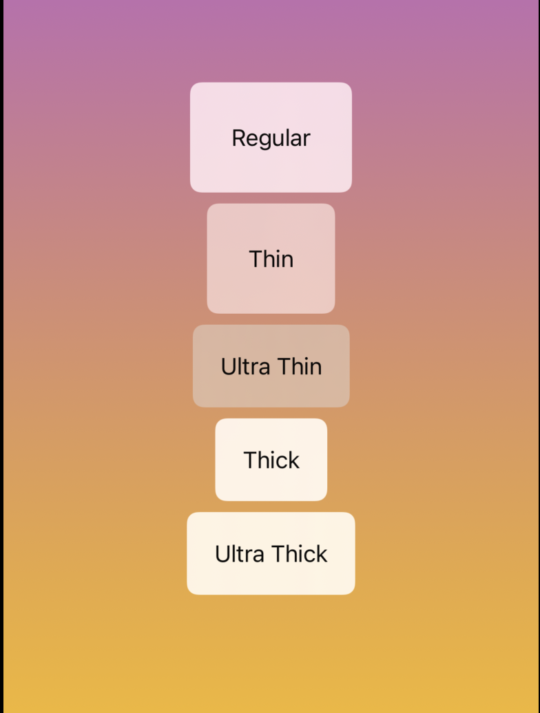
Apple provides us with 5 different types of material thickness. The thicker the material, the more opaque it is and provides better contrast between the foreground and the background.
Here are all 5 types:
- regular
- Ultra Thin Material
- Thin Material
- Thick Material
- Ultra Thick Material
Here are all 5 in action:
The full code of this project is available on GitHub.