How to Create Buttons in SwiftUI
Every user interface needs buttons. Buttons used to be a pain in iOS programming because of UIKit's lack of structure, but with the advent of SwiftUI, working with buttons has become much simpler and more enjoyable. Since its first release with the iOS 13 Software Development Kit (SDK), SwiftUI has included a plethora of modifiers that expand its already impressive range of features and customization options. It eliminates monotonous tasks and provides developers with greater freedom.
In this guide, I'll show you how to use this SwiftUI component, and you'll pick up the following skills to design a basic button and process the user's input.
Starting a New SwiftUI-Enabled Project
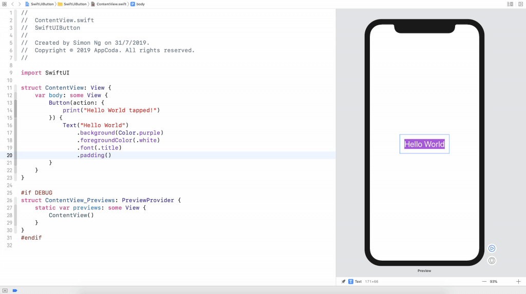
Let's get our feet wet with SwiftUI by making a basic button. Fire up Xcode and create a new project using the Single View Application template. Simply enter the project's title. You're allowed to use any name you choose; I just used SwiftUIButton. Simply make sure the Use SwiftUI box is checked.
After you've finished working on the project, Xcode will load the ContentView.swift file and show you a preview of it in the design canvas. If the preview isn't shown, use the canvas's Resume button.
Implementing a Basic Button in SwiftUI
SwiftUI makes it simple to design and implement buttons. The following piece of code may be used to make a button:
Button(action: {
    // What to perform
}) {
    // How the button looks like
}
You'll need to provide two chunks of code when making a button:
- What to do - the code to execute after the user taps or selects the button.
- Code describing the button's appearance and behavior.
If you just want to convert the Hello World label into a button, for instance, you might make the following changes to the code:
struct ContentView: View
{
<br>
 var body: some View
{
<br>
Button(action:
{<br>
print("Hello World tapped!")
<br>
})
 {<br>
Text("Hello World")<br>
   }<br>
}<br>
}
As a result, the canvas now displays the words "Hello World" as a clickable button.
Within the design canvas, the button is now unable to tap. To try it out, just hit the Play button. In order to see the Hello World tapped message, however, you must first right-click the Play button and choose Debug Preview from the context menu. When you press the button, the information will display on the control panel.

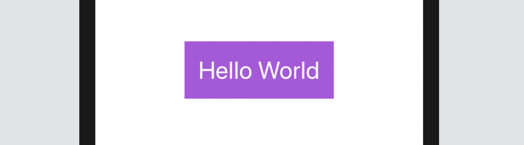
Font and Background Modifications for the Button
Now that you know how to make a basic button, we'll look at how to modify its style using in-built options. For instance, you may use the background and foregroundColor modifiers to modify the color of the backdrop and the text, respectively:
Text("Hello World")
    .background(Color.purple)
    .foregroundColor(.white)
To alter the font family, just add the font modifier followed by the family name (e.g.,.title):
Text("Hello World")
    .background(Color.purple)
    .foregroundColor(.white)
    .font(.title)
The revised button should resemble the one seen below

The button, as you can see, is poorly designed. Don't you think it'd be fantastic if there was a little breathing room between each line of text? You may use the padding modifier to get that effect by setting it up as follows:
Text("Hello World")
    .padding()
    .background(Color.purple)
    .foregroundColor(.white)
    .font(.title)
After making the modification, the canvas should refresh the button. The improved button design should be easily noticeable.
It Matters Where You Put Those Modifiers
I'd want to draw attention to the importance of putting the padding modifier before the background modifier. The following code will provide a different outcome.
Even if you don't want to use your chosen background color for the button, you can still provide some paddings by putting the padding modifier after the background modifier. The explanation may be found in the following reading of the modifiers:
Text("Hello World")
    .background(Color.purple) // 1. Change the background color to purple
    .foregroundColor(.white)  // 2. Set the foreground/font color to white
    .font(.title)             // 3. Change the font type
    .padding()                // 4. Add the paddings with the primary color (i.e. white)
If, on the other hand, you put padding before background, things will work out like this:
Text("Hello World")
    .padding()                // 1. Add the paddings
    .background(Color.purple) // 2. Change the background color to purple including the padding
    .foregroundColor(.white)  // 3. Set the foreground/font color to white
    .font(.title)             // 4. Change the font type
Including Frames Around the Button
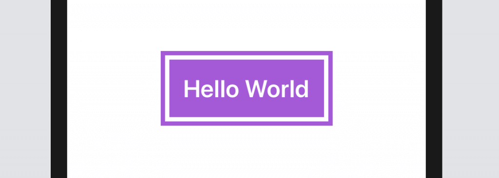
The padding modifier need not necessarily go at the beginning of a string. All that matters is the style of button you use. Assume you wish to design a button with these margins:

The Text control may be modified using the following code:
Text("Hello World")
    .foregroundColor(.purple)
    .font(.title)
    .padding()
    .border(Color.purple, width: 5)
Here, purple is used as the foreground color, and empty spaces are added around the text. Using the border modifier, you may set the border's width and color. Change the width parameter's value and witness the effects for yourself.
Permit me to provide another example. So, a designer shows you this button they've created. Where do you plan to take what you've learned and use it in the real world? Please take a few moments to try to solve the problem on your own before reading on.
Okay, here is the code you need:
Text("Hello World")
    .fontWeight(.bold)
    .font(.title)
    .padding()
    .background(Color.purple)
    .foregroundColor(.white)
    .padding(10)
    .border(Color.purple, width: 5)
In order to get the desired button appearance, we use a combination of two padding modifiers. You can make a button with padding and a purple background using the first padding and the background modifier. The border(round, purple) modifier instructs the browser to paint a rounded border around the button, and the padding(10) modifier pads out the area surrounding it.
Okay, let's look at a more involved illustration. Is there any way to make the button look like this instead?
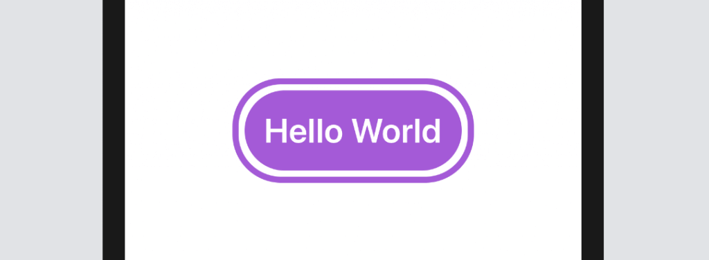
A built-in SwiftUI modification called cornerRadius makes it simple to implement rounded corners. Just use the modifier and set the corner radius to render the button's background with rounded corners:
.cornerRadius(40)Since the border modification doesn't support rounded corners, adding a border with rounded corners will need some more effort. So, let's outline the button and place it above it. The completed code is as follows:
Text("Hello World")
    .fontWeight(.bold)
    .font(.title)
    .padding()
    .background(Color.purple)
    .cornerRadius(40)
    .foregroundColor(.white)
    .padding(10)
    .overlay(
        RoundedRectangle(cornerRadius: 40)
            .stroke(Color.purple, lineWidth: 5)
    )
With the overlay modifier, you may superimpose one view over another. In the code, we used the RoundedRectangle object's stroke modifier to create a border with rounded corners. The stroke modifier lets you change the stroke's color and width.
Making a Button with Some Graphics and Some Words
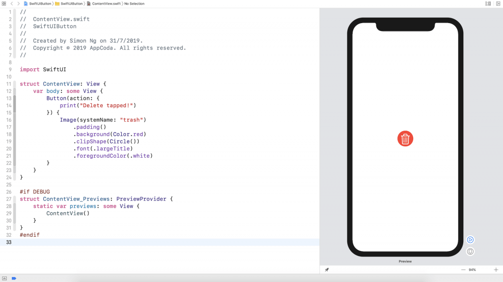
To now, we've solely implemented text links. You or your designer may need to show a picture button in a real-world project. Making an image button follows the same syntax as creating a text button, with the exception of using the Image control.
Button(action: {
    print("Delete button tapped!")
}) {
    Image(systemName: "trash")
        .font(.largeTitle)
        .foregroundColor(.red)
}
Conveniently, the picture button is made using existing SF Symbols (such as a garbage can). If we want the picture to be somewhat enlarged, we may use the font modifier.largeTitle. This is the proper format for your button:

Similarly, the same set of adjustments will allow you to make a circular image button with a single backdrop color. An illustration is provided in the following image.
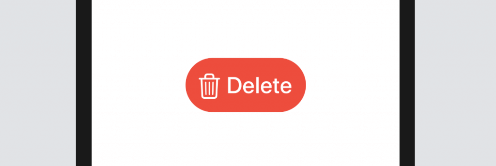
A button may be made using either text or an image. You may choose to add the term "Delete" to the icon's label, for example. Substitute this into the code:
Button(action: {
    print("Delete tapped!")
}) {
    HStack {
        Image(systemName: "trash")
            .font(.title)
        Text("Delete")
            .fontWeight(.semibold)
            .font(.title)
    }
    .padding()
    .foregroundColor(.white)
    .background(Color.red)
    .cornerRadius(40)
}
Here, we've combined the picture and text control into one neat little package. The delete symbol and the word "Delete" will be shown next to one another. Using modifiers, we can change the HStack's background color, add padding, and round the edges of the buttons. The resultant button is seen in the image below.