Using Flexbox in React Native
Introduction
There is a good chance that you are already acquainted with flexbox if you have experience with mobile app development or frontend development. Don't stress if you don't understand. If you follow this course all the way through, you'll have a firm grasp of flexbox layout's fundamentals and how to put them into practice. Find out first what information our lesson provides. These are the primary topics we'll discuss in this article.
- Review of Flexbox as a Layout Format
- Several React Native Layout Variations
- Characteristics of a Flexbox Layout
- Using flexbox in a React Native app's layout
Now we'll get to the first real segment. Discover the meaning of flexbox via some reading.
Definition of Flexbox and Core Ideas Behind Flexbox Layouts
The Flexible Box Module, or flexbox, is a paradigm for building a single-dimensional interface. But what exactly does this flat design imply? Simply said, it explains that the flexbox paradigm is predicated on the idea of a layout with a single dimension at a time, which might be a row or a column.
Furthermore, flexbox provides extensive alignment options and the flexibility to allocate space between interface elements as needed. Flexbox layout has simplified the life of developers by reducing the difficulties associated with making applications responsive.
Introduction to Flexbox Layout Concepts
Flexbox, on Two Different Axes
Flexbox handles two dimensions:
- Key Axis: The attribute flex-direction is what specifies it.
- Perpendicular to the primary axis, the Cross Axis
Boundary Lines
Previously, left-to-write writing mode was prioritized and set as the default in CSS. With the advent of new layout techniques, however, a plethora of new writing styles became available. As a result, it eliminated the presumption that text lines should run from left to right, beginning at the top of the page.
Flexible Packaging Conventions
The term "flex container" refers to the section of the document that will have the flex attribute applied to it. Simply designating the area's container's display attribute as flex or inline-flex will produce a flex container. Also, anything within the area's container will transform into a flex item.
Here are some other flexbox settings for React native development.
Characteristics of React Native's Flexbox Layout
In this piece, we'll go over some of the flexbox attributes that might improve the visual style of your app.

Using Flexbox for a Layout in React Native
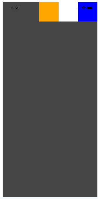
Let's add flexbox support to our React Native app. In the parent container of our sample app, we'll have three widgets:
- orange box
- white box
- green box
There is a View Component serving as both the parent and child container.
// Layout
const App = () => {
return (
   <View style={styles.container}>
     <View style={styles.orangeBox} />
     <View style={styles.whiteBox} />
     <View style={styles.greenBox} />
   </View>
 );
};
// Style
const styles = StyleSheet.create({
 container: {
   backgroundColor: '#454545',
 },
 orangeBox: {
   width: 80,
   height: 80,
   backgroundColor: 'orange',
 },
 whiteBox: {
   width: 80,
   height: 80,
   backgroundColor: 'white',
 },
 greenBox: {
   width: 80,
   height: 80,
   backgroundColor: 'blue',
 },
});
/ Layout
const App = () => {
return (
<View style={styles.container}>
<View style={styles.orangeBox} />
<View style={styles.whiteBox} />
<View style={styles.greenBox} />
</View>
);
};
Output:

Flexible Native Reaction
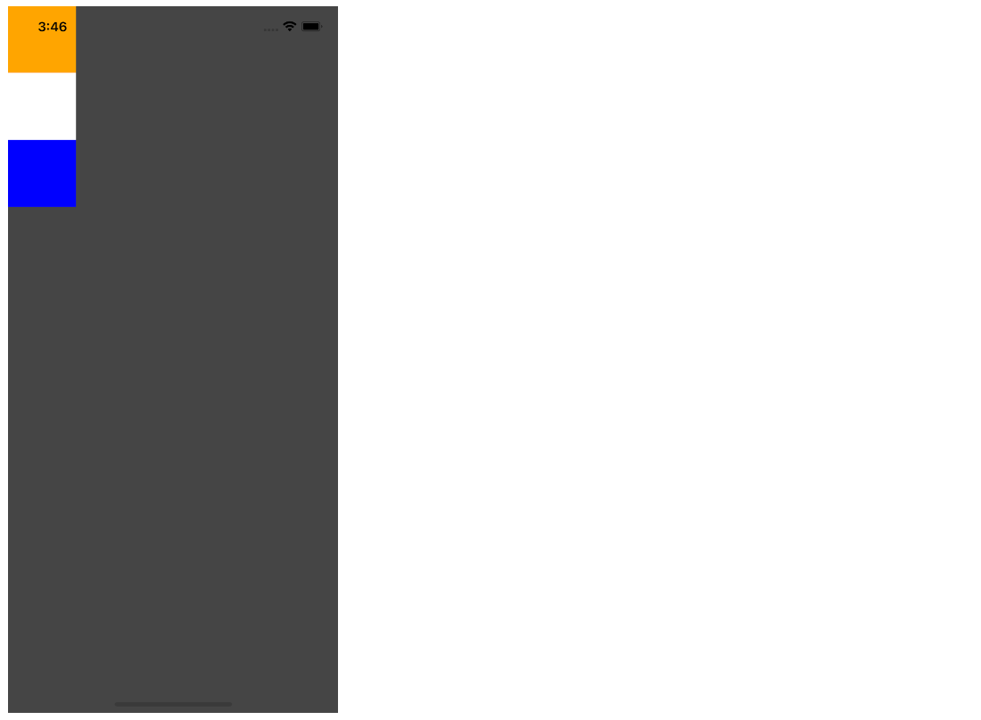
Once we set the property is flex: 1, the area is partitioned into a single group, allowing our parent container to fill the entire viewport.
container: {
   flex: 1,
   backgroundColor: '#454545',
 },
Output:
Respond Locally Adapt in Any
flexDirection determines the way subelements of the parent container will bend. The possible flexDirection values are shown below.
- column - This is the default setting for this column. All of the children are aligned vertically. When wrapping is turned on, the line that follows the first item in the top container will begin to the right.
- row – This setting arranges content so that it reads left to right. If you enable wrapping, the new line will appear beneath the first item on the container's left side.
- column-reverse Causes items to be aligned from bottom to top instead of left to right. When wrapping is turned on, the line below the first item in the bottom container will begin to the right.
- row-reverse Causes items to be aligned from right to left instead of the usual left to right. Wrapping will be accomplished by beginning the following line just beneath the first item in the correct container.
container: {
 flex: 1,
flexDirection: 'row',
backgroundColor: '#454545',
},
Output:

Justification of Content in Native React Applications
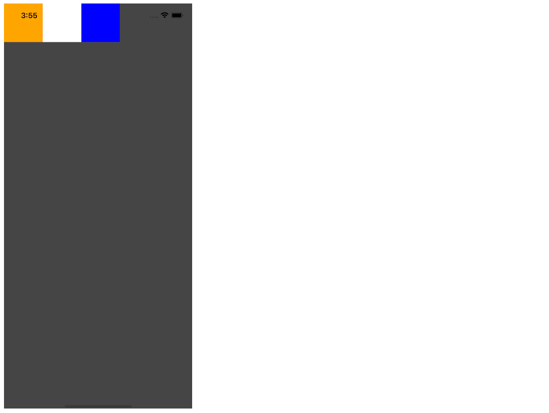
Child items may be aligned along the primary axis of the parent container using justifyContent. Row and column flexDirection options allow you to arrange the items in a horizontal or vertical fashion. Additional benefits of the site include:
- the initial flex-start value is used by default. Sets the starting position of the alignment to the main axis of the container.
- When used on a container, flex-end-align makes all of its contents align with the last end of the container's primary axis.
- enter- Centers content along the vertical axis of the container.
- Spread the remaining spaces among the children uniformly along the container's main axis, then space out the components evenly.
- space-around Distribute the leftover space evenly around the kids' heads along the container's main axis after spacing out the parts.
- Spreads things out equally in space. The distances between each pair of objects, as well as the distance between the first item and the main-start edge and the final item and the main-end edge, are all the same.
Let’s see a few examples.
container: {
flex: 1
flexDirection: 'row',
justifyContent: 'flex-start',
backgroundColor: '#454545',
},
Output:
justifyContent: ‘flex-end’
justifyContent: ‘center’

justifyContent: ‘space-around’

Items to Align in a Native Reaction
When using alignItems, the child is positioned such that it aligns with the parent container's cross axis. This feature, like justifyContent, will center the offspring along the cross axis.
Let's look at a few instances.
alignItems: ‘flex-start’
container: {
   flex: 1,
   flexDirection: 'row',
   justifyContent: flex-start',
   alignItems: flex-start,
   backgroundColor: '#454545',
 },
Output:

As such, this concludes our discussion of the learning and use of the Flexbox layout in React Native. To that end, I hope this guide was helpful.
Conclusion
Once you get the notion behind Flexbox, you'll adore working with it since it's so simple to keep up and comprehend. Message us back with any questions, comments, or recommendations. Likewise, feel free to provide recommendations for subjects that you'd want us to cover in a lesson. Keep studying!