How to Create Custom View Modifiers in SwiftUI
Whenever you feel like changing the text color or change width of an image, you are basically using view modifiers in SwiftUI to do so. Not only that you can use View modifier to change the behavior of a button or a textfield as well. View Modifiers are extremely powerful and with the ViewModifier protocol we can make our own custom view modifiers as well.
ViewModifier returns the modified view and we can chain them together to get the final result. View Modifiers can also be used to bundle multiple other view modifiers together to reduce duplicate code in your project. In this article, we will look at creating three view modifiers. The first view modifier will be bundling multiple view modifiers together and applying our custom modifier to a Text view. The other will be for a Button. The last modifier will be for a TextField to check if the email entered is valid or not and if it is valid it will change the color of the textfield border.
TextView View Modifier
Let's say that there is a certain style of text that we are using in our project. Such as:
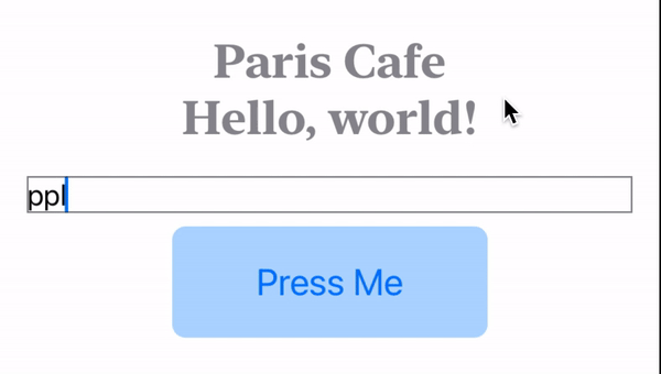
Text("Paris Cafe")
      .fontDesign(.serif)
      .lineLimit(1)
      .font(.title)
      .foregroundColor(.blue)
      .bold()
Now, we are using this style in multiple views and writing these modifiers for Text view is repetitive work. We can use a custom view modifier to fix this issue. Here is how:
Lets create a new struct conforming to ViewModifier protocol and call CustomTitleModifier. Here is how the our struct will look like.
struct CustomTitleModifier: ViewModifier {
  func body(content: Content) -> some View {
    content
      .fontDesign(.serif)
      .lineLimit(1)
      .font(.title)
      .foregroundColor(.blue)
      .bold()
  }
}
When conforming to ViewModifier protocol, you need to implement the body function that takes in content and returns some View. The content is basically the view to which the modifier is attached to. Now inside the body function, we can apply our text view modifiers.
Thats about it. Now back in the ContentView.swift file we can do the following:
struct ContentView: View {
    var body: some View {
        VStack {
            Text("Paris Cafe")
                .modifier(CustomTitleModifier())
        }
    }
}
So, on the Text view add .modifier and pass it the CustomTitleModifier struct instance. And thats about. Now, if you don't want to use this .modifier and attach the CustomTitleModifier directly to the Text view, we can create an extension like so:
extension Text {
    func customModifier() -> some View {
        modifier(CustomTitleModifier())
    }
}
Here, we are creating a function called customModifier and it returns some View. Inside that function we are calling the modifier function and passing in the CustomTitleModifier() struct instance. Now, back in ContentView we can just call the customModifier() function like so:
struct ContentView: View {
    var body: some View {
        VStack {
            Text("Paris Cafe")
                .customModifier()
        }
    }
}
Button Label View Modifier in SwiftUI
Most apps use a certain button styling throughout the app. Again this means repetitive code and we again can use some sort of a View Modifier to bundle all the styling modifiers into one. This is how we are styling our button:
Button {
      print("Press Me!")
  } label: {
      Text("Press Me")
          .font(.title2)
          .padding(.horizontal, 50)
          .padding(.vertical, 20)
          .foregroundColor(Color.blue)
          .overlay(
            RoundedRectangle(cornerRadius: 8)
              .fill(.blue)
              .opacity(0.3)
          )
  }
Let's create a custom modifier just like before:
struct CustomButtonModifier: ViewModifier {
    func body(content: Content) -> some View {
        content
          .font(.title2)
          .padding(.horizontal, 50)
          .padding(.vertical, 20)
          .foregroundColor(Color.blue)
          .overlay(
            RoundedRectangle(cornerRadius: 8)
              .fill(.blue)
              .opacity(0.3)
          )
    }
}
Again we created a struct and conformed it to the ViewModifier protocol and inside the body function add all the modifiers to the content. This function will return a view.
Let's implement this new custom modifier now on the Button. So inside the label closure, underneath the Text("Press Me") we will add the modifier and this how the code will look:
Button {
    print("Press Me!")
} label: {
    Text("Press Me")
        .modifier(CustomButtonModifier())
}
Creating an Email Validator Modifier in SwiftUI
This will be a little more complex and comes under the umbrella of Conditional Modifiers, meaning this will modify the view only if certain condition is met. So, basically we implement a TextField to enter email. If the email is valid we will turn the border around the textfield green else it will stay as it is.
First we will create an ObservableObject class called EmailChecker:
class EmailChecker: ObservableObject {
    let pattern = "[A-Z0-9a-z._%+-]+@[A-Za-z0-9.-]+\\.[A-Za-z]{2,64}"

    @Published var email = ""

    func isValid(_ email: String) -> Bool {
        return (email.range(of: pattern, options: .regularExpression) != nil)
    }
}
In this class we have a @Published property called email which SwiftUI will keep track of for us. Inside the isValid function, we are passing a string and checking if that string is a valid email address. We do this using regular expression also known as regex. If the regex successfully finds the match it returns True else its False.
Let's look at the custom modifier now:
struct EmailValidator: ViewModifier {
    var value: String
    var validator: (String) -> Bool
    func body(content: Content) -> some View {
        content
            .border(validator(value) ? .green : .secondary)
    }
}
This custom modifier called EmailValidator has two stored properties. Value which is of type string and validator which is a closure (aka a function). Validator takes in the string and returns Boolean. Within the body function, we are applying border to the content and within the border arguments using the validator to check if the email entered is valid or not, in which case the border color turns green else it stays .secondary.
Now we will call this custom modifier underneath the TextField. Remember that the view modifier's order matter.
This is how we will call this modifier in ContentView:
struct ContentView: View {
    @ObservedObject var validator = EmailChecker()
    var body: some View {
        VStack {
            TextField("Email", text: $validator.email)
                .modifier(EmailValidator(value: validator.email, validator: { someEmail in
                    validator.isValid(someEmail)
                }))

        }
    }
}
Inside the ContentView, we are assign the variable validator an instance of EmailChecker. Make sure you mark this as ObservedObject. Then we bind the text property of TextField to the validator.email. Then we will use the .modifier function and pass the custom View Modifier.
This view modifier requires two parameters: email and the validator function. So, we will pass the validator.email and then we will pass the implementation for the validator which will be validator.isValid() function.
So, here is how this view modifier works:
- We call this modifier by initializing the
EmailValidatorstruct with the textfield input (the email) and the function that checks if the email is valid or not.
.modifier(EmailValidator(value: validator.email, validator: { someEmail in
    validator.isValid(someEmail)
}))- Then the
bodyfunction of the view modifier runs, where it first calls thevalidatorfunction by passing in thevalueand checks if the email is valid or not. If it is valid, it adds green colored border around the textfield.
func body(content: Content) -> some View {
    content
        .border(validator(value) ? .green : .secondary)
}